Winning back members who stopped trusting the app
Restarting the app behind one of Egypt's largest premium gyms
About the project
The front door was broken
BeFit is one of Egypt's largest premium gyms and an official Hyrox training club, with thousands of members. Its app was supposed to be the front door to all of that: memberships, class booking, gym access. Instead, members were pulling up their payment receipts and showing them at the reception desk to get in. Some forged the screenshots.
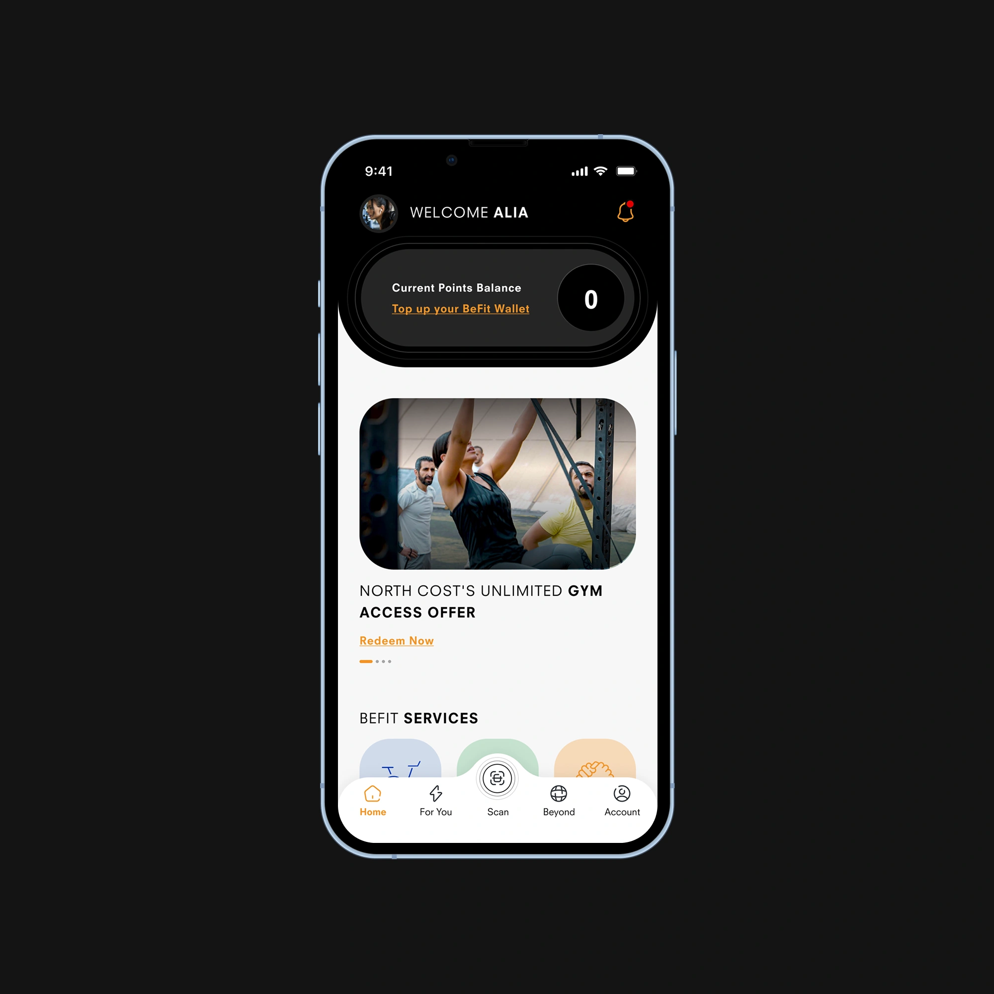
The app was buggy, cluttered, and visibly off-brand, far enough from what a premium gym should feel like that the CEO told us, plainly, that he was embarrassed by it. For a business built on a premium experience, that gap (polished gym, broken app) wasn't cosmetic. It was a trust problem. Members had stopped believing in the product, and so had the business.
The brief
I joined BeFit as the Product Designer on a small team brought in to fix the product: a lead engineer, mobile developers, a project manager, and me. It was an ongoing, part-time engagement rather than a one-off, which shaped everything: we worked in iterations, shipped, learned, and came back, instead of delivering one redesign and walking away.
The CEO's brief was ambitious. The app was missing core functionality. You couldn't properly manage a membership, book group classes, or buy products like private training, nutrition plans, or physiotherapy. There was no analytics in place at all. His vision was to make every BeFit interaction digital and managed from a single app. The redesign was the restart that had to make that possible.
How I approached it
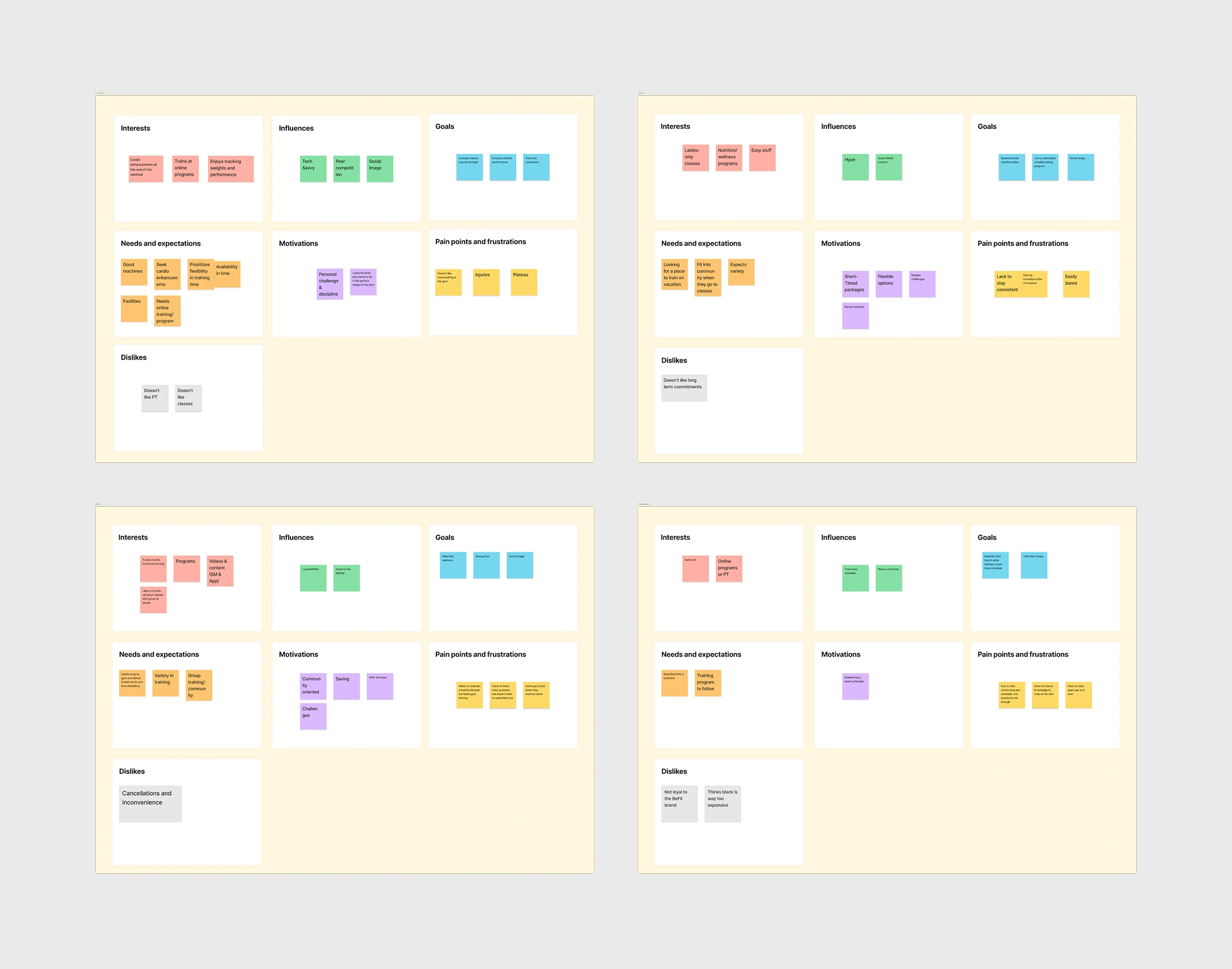
We started offline, with the BeFit team, running workshops to define a product vision, a strategy, and a prioritized roadmap, and to surface the customer problems their teams saw every day. Together we built a customer proto-persona, less as a research deliverable and more as a shared reference we could all point to when deciding what mattered.
From there I ran a full UX audit of the existing app, using heuristics as the backbone to surface usability flaws and prioritize what to fix first.
I'll be honest about the constraints, because they shaped every decision that followed: there was no product analytics (none had ever been set up) and no time for proper user interviews, since BeFit wanted the app out before the summer season. So I worked with what I had: stakeholder knowledge, heuristic rigor, and direct, informal conversations with members wherever I could get them.
Pillar one: fixing gym access
Buying a membership was treated like buying any other product: no status, no card, no signal in the UI that you were even a member. To get in, you showed your transaction receipt to the receptionist, though in practice even that rarely happened. Staff waved through familiar faces, so there was no reliable way to know who actually had an active membership. It was open to abuse, and some members forged screenshots to get past the desk.
My first instinct was to solve it properly with NFC gates: tap to enter, no human in the loop. The business pushed back on cost, since BeFit had a lot of locations, so we started cheaper with a barcode staff could scan to verify a membership. That shipped, and reality pushed back again. Receptionists still didn't scan the regulars; the honor system had just moved into the app. So we piloted electronic gates at a single branch to actually govern entry before rolling them wider.
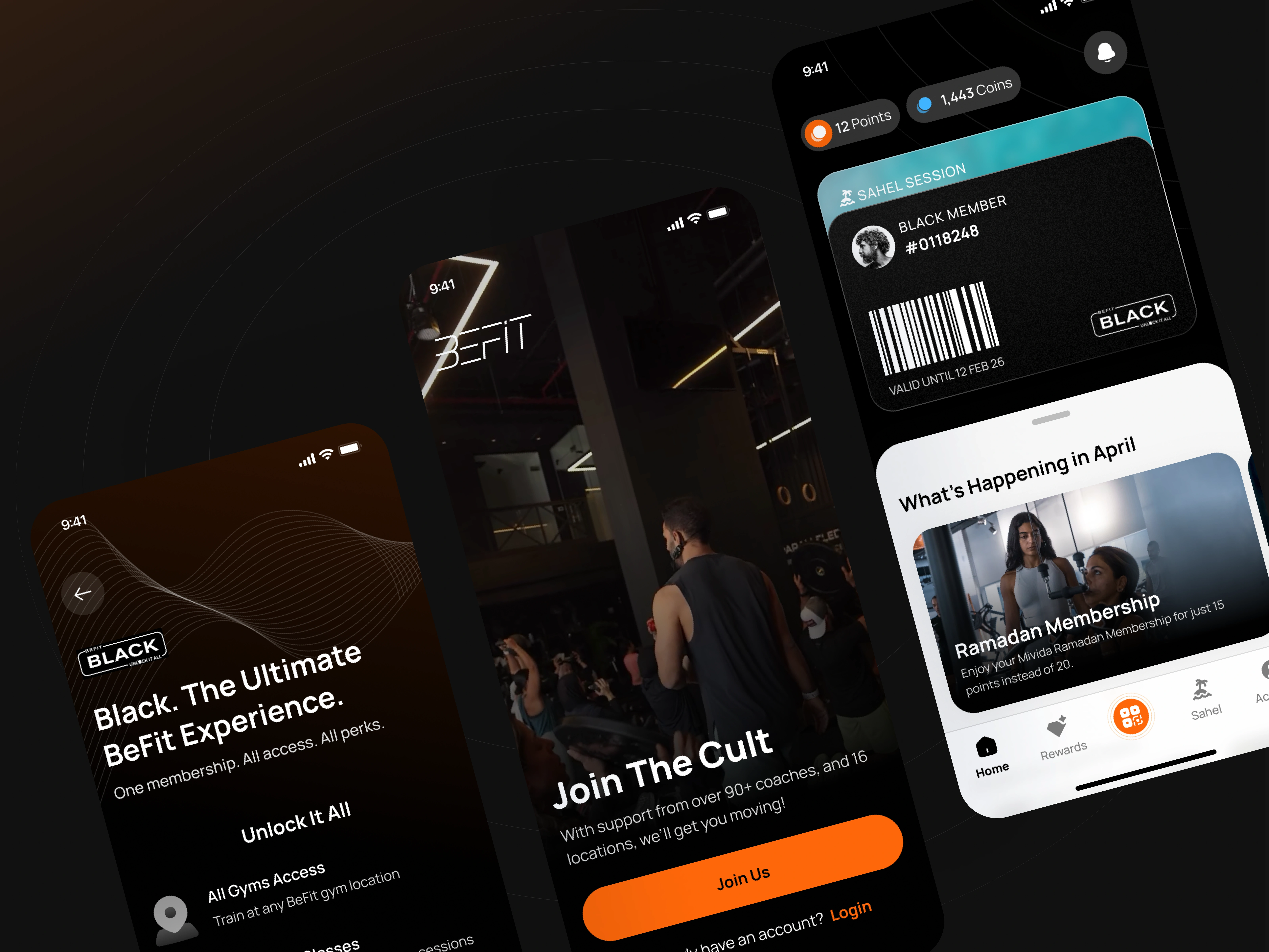
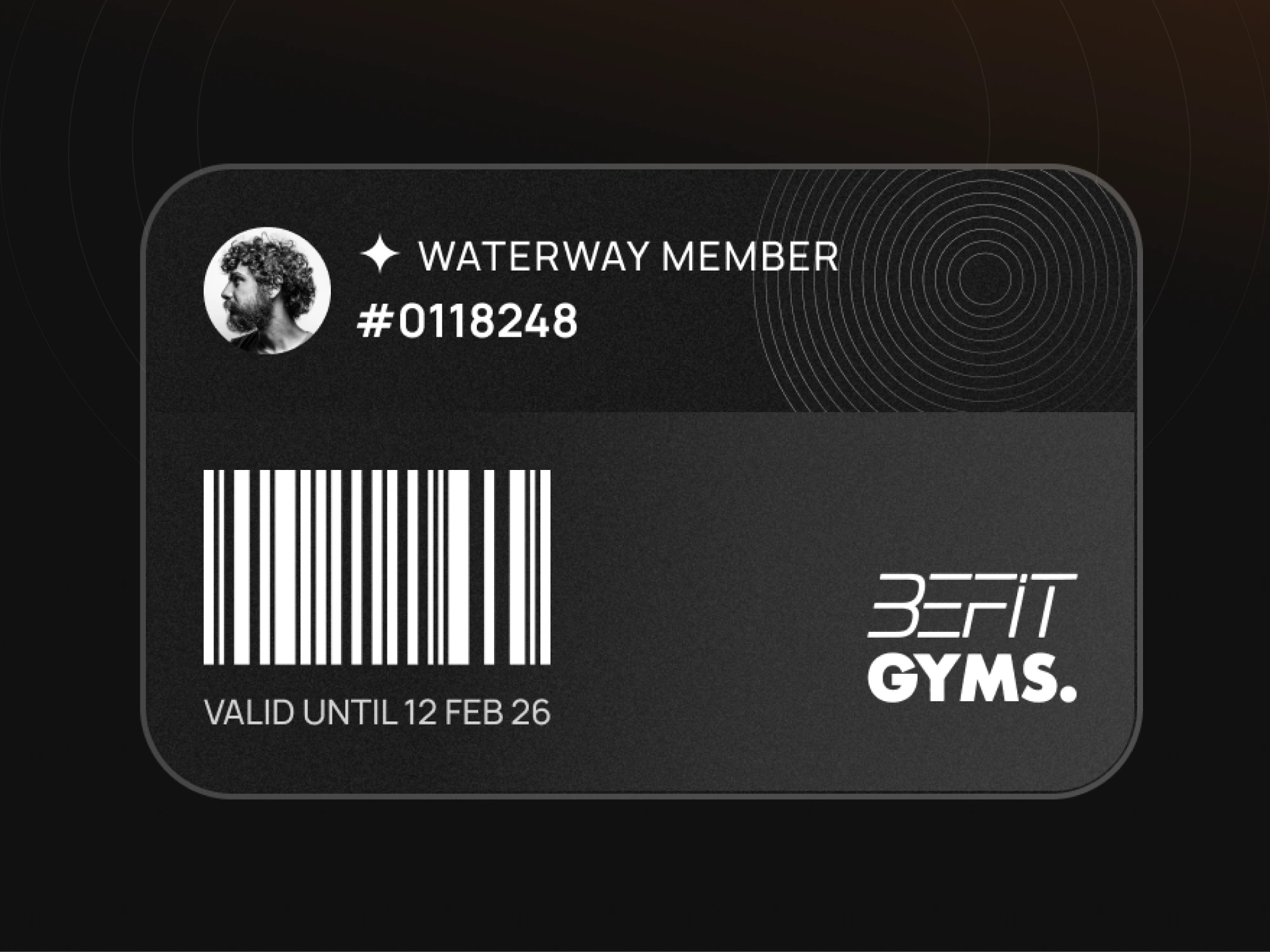
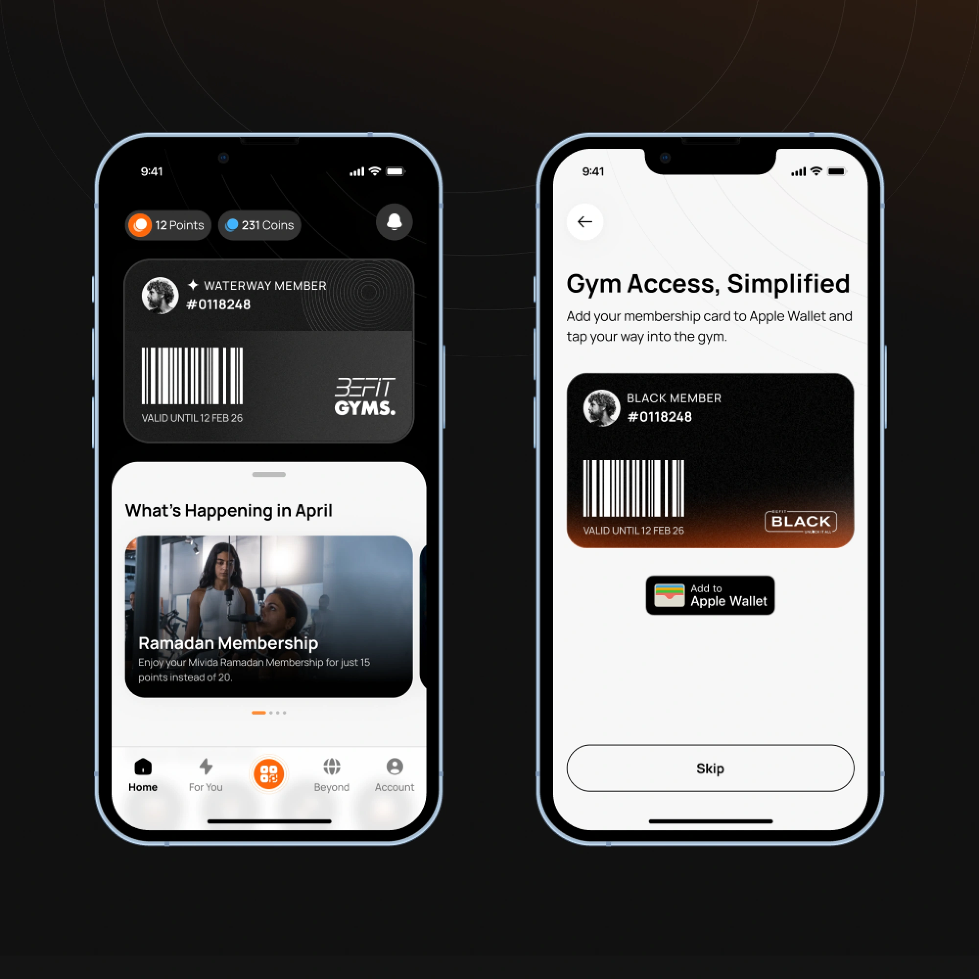
On the app side, I introduced a membership card. It did three things at once: it felt branded and premium, it finally gave members the visible status the old app never offered, and it set up Apple and Google Wallet so entry was as simple as pulling out your phone. The barcode stayed underneath, since the gates relied on it. And because every entry now ran through a scan, BeFit finally had the occupancy and traffic data it had been missing, the kind we planned to eventually surface back to members.
Pillar two: collapsing the checkout
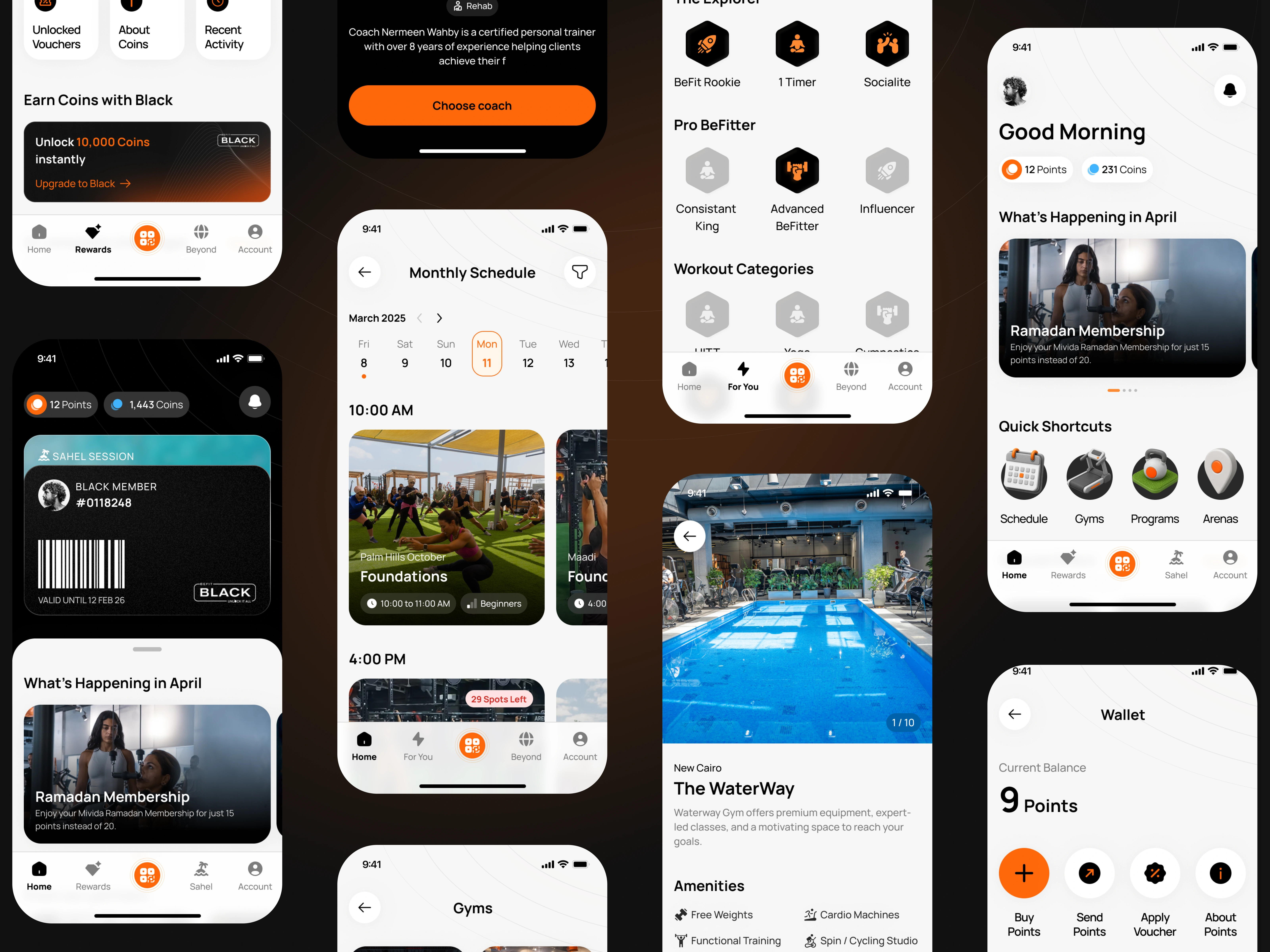
BeFit runs on a virtual currency called BeFit Points: members buy Points, then spend them on classes, memberships, drop-ins, and products. Points are core to the business, so removing them was never on the table, which left two design problems.
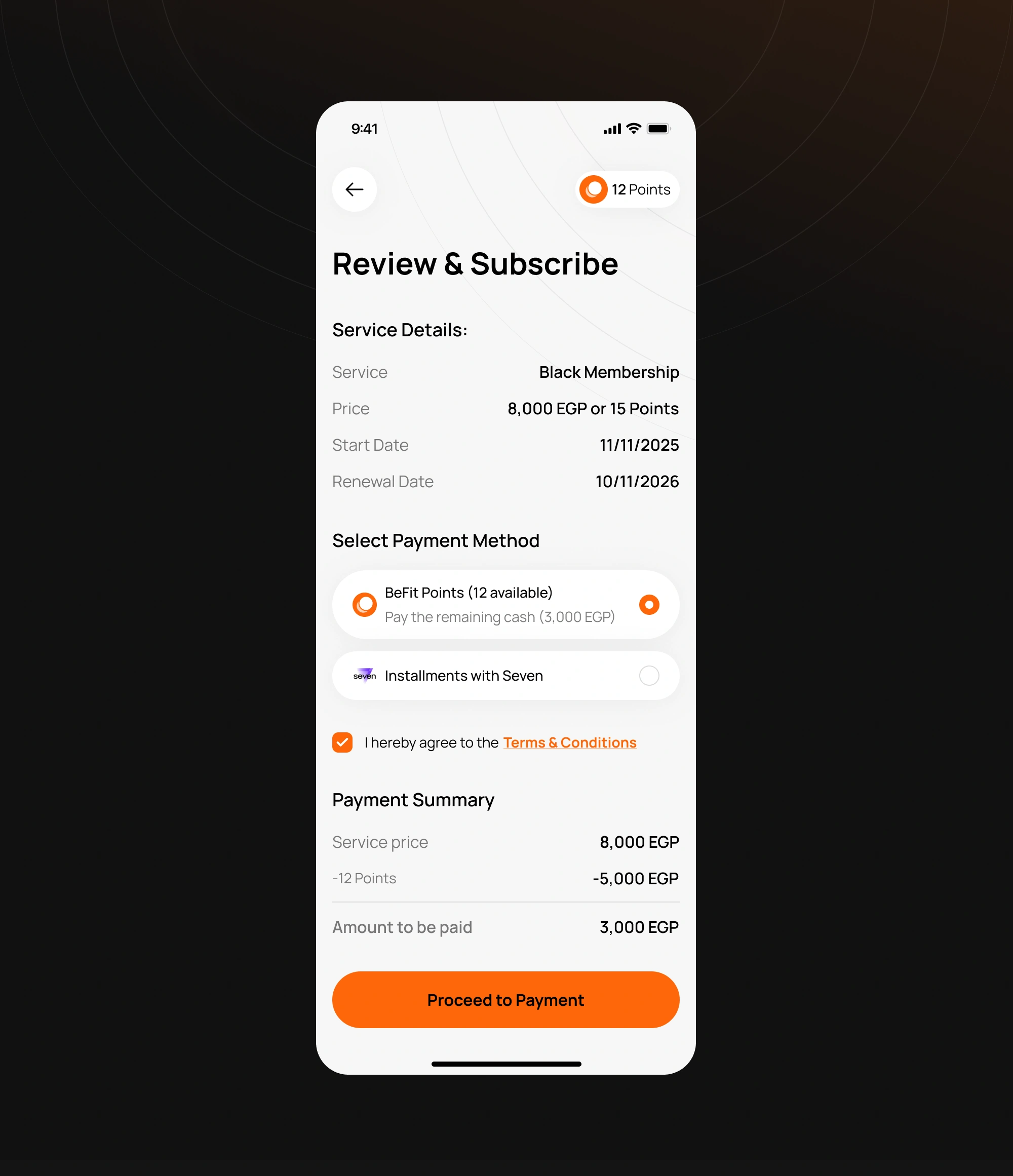
The first was pricing. A Point price alone hid what things actually cost, and I'd watched members translate Points back into real money before committing. So we showed both, Points and EGP, everywhere. It added visual weight I'd normally avoid, but it was the honest tradeoff: members needed the real cost, and the business couldn't give up Points.
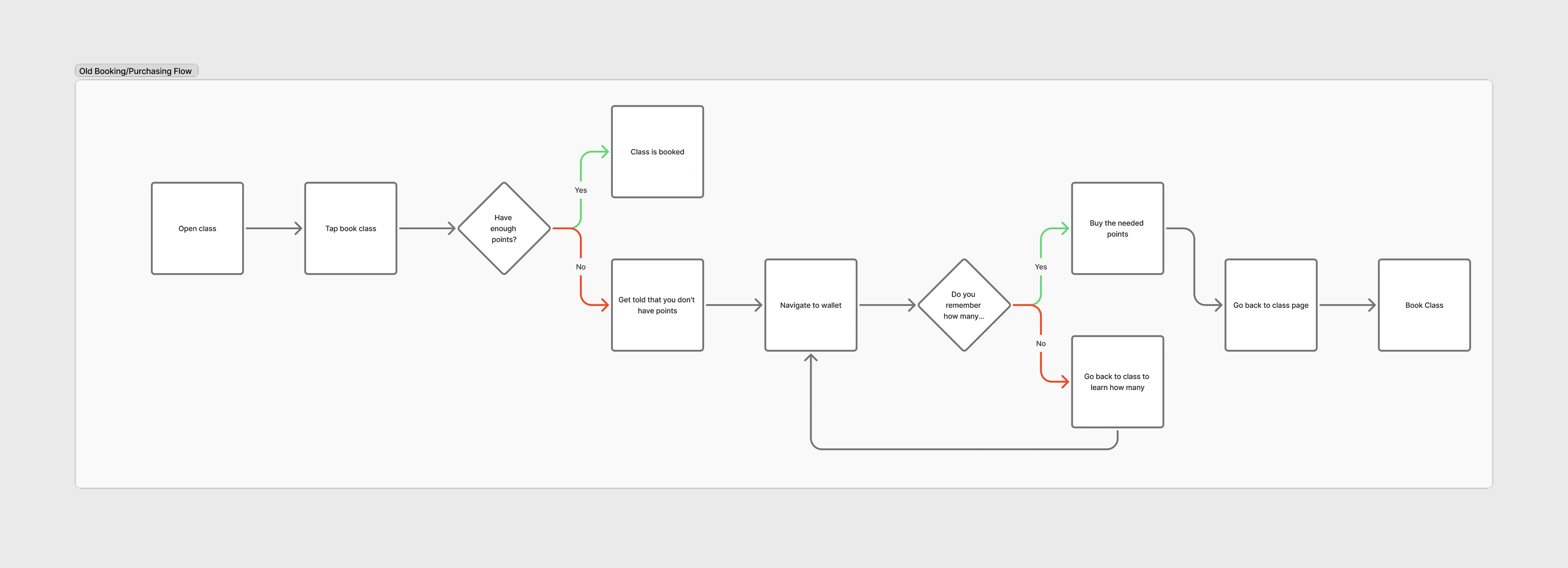
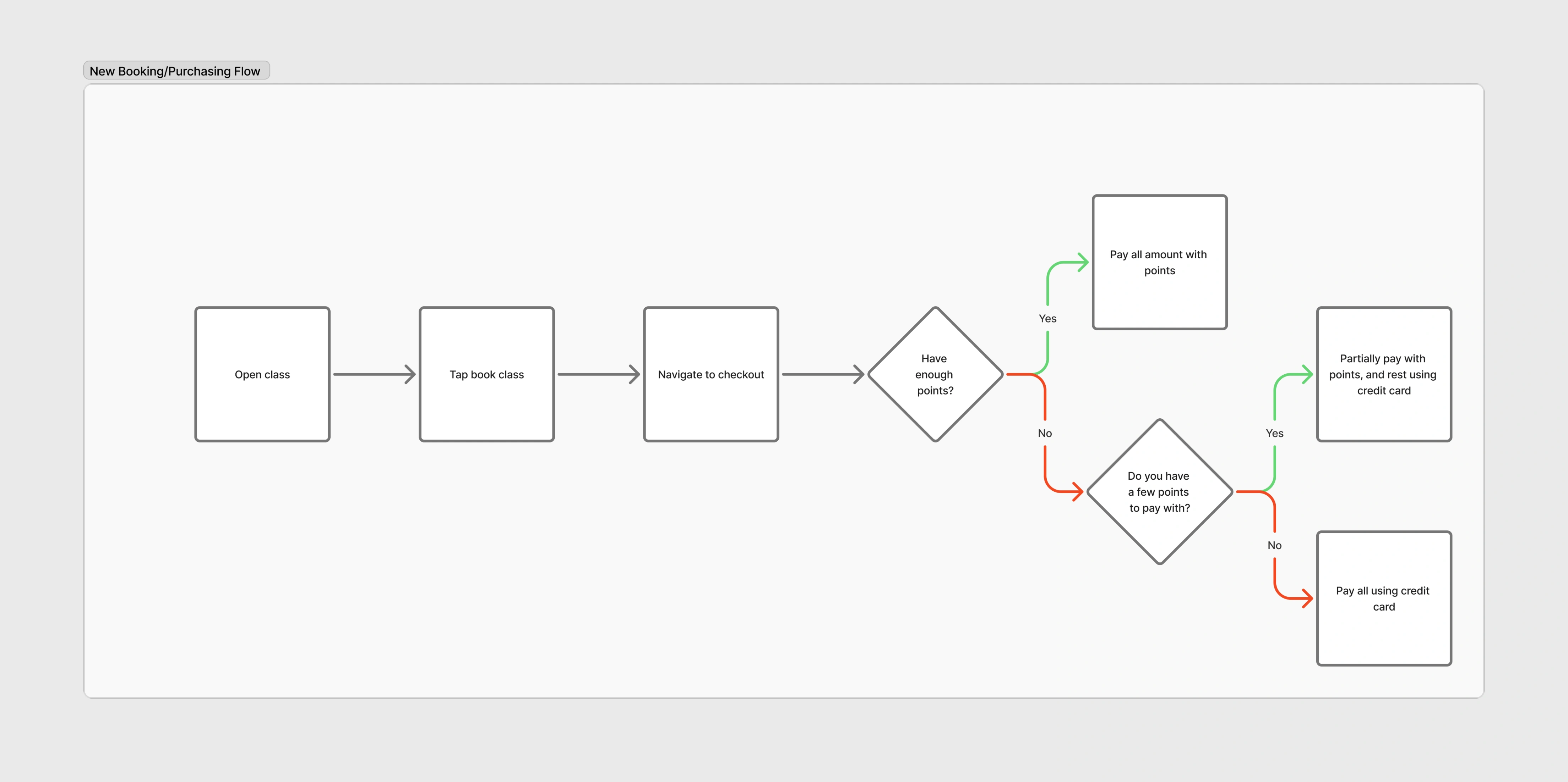
The second was checkout. If you didn't have enough Points to book a class, the old flow ran eight steps across three screens: try to book, get told you're short, leave for the wallet, work out (and remember) how many Points you needed, buy them, come back, book. I collapsed it into one. A checkout module sits at the point of purchase: book, then pay however you can, fully in Points, partially, or straight on card. For the card path, the backend quietly buys the exact Points needed and books on the member's behalf, so it still records correctly against the Points economy. The member just sees: book, pay, done.
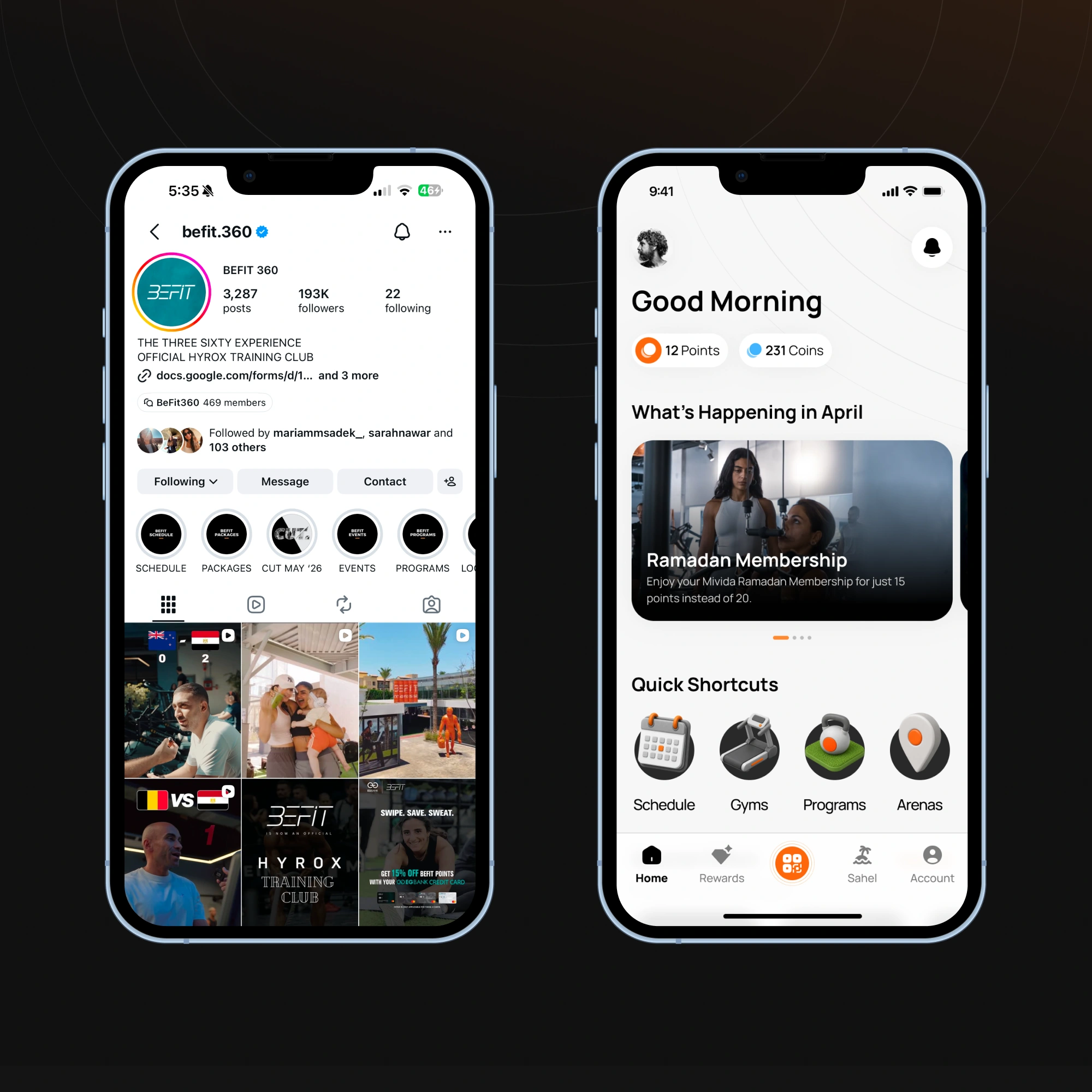
Home & information architecture
The new home screen was built around convenience: quick shortcuts to the handful of things members actually came to do, like finding and booking group classes, seeing arena locations, or managing subscriptions. When I asked members where they currently went to learn about BeFit's schedule and locations, the answer was consistent: Instagram story highlights. So I leaned into a pattern they already understood, designing the shortcut row to echo those highlights. Not every call here was mine: the BeFit team insisted on surfacing badges prominently, which I'd have weighted differently. That was one of several honest tradeoffs between what the business wanted forward and what I'd have prioritized.
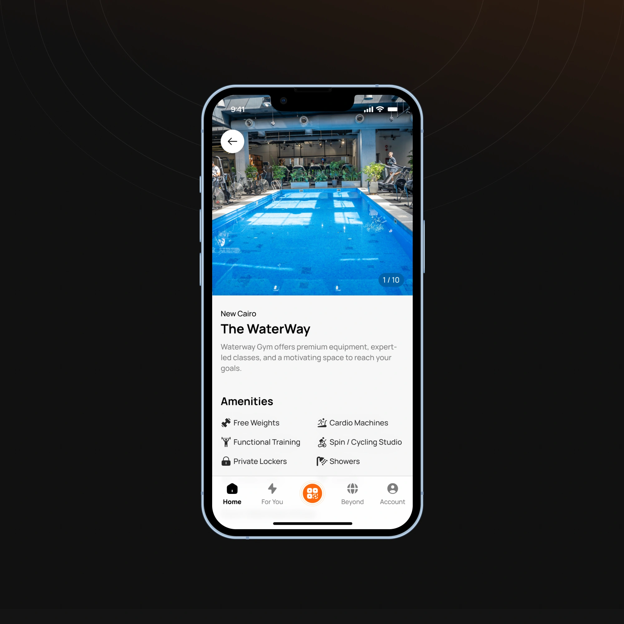
The gym page
There was no real gym page in the old app, so I designed one from scratch. I asked members, casually, how they actually choose a gym: it came down to the machines, the amenities, the location, and good imagery. So the page leads with exactly those. I also built a library of amenity icons covering every gym, so the content team can assemble accurate, consistent gym pages straight from the dashboard rather than routing every one through design.
Building the foundation to measure
Because none of this had ever been measured, I treated analytics as part of the design work, not an afterthought. We brought in Amplitude, and I led the definition of the app's event taxonomy so we could finally see how people used what we built. And because the core problem was trust, I introduced CSAT measurement specifically. We'd heard plenty of warm qualitative feedback, but I wanted something we could actually track over time.
That foundation paid for itself quickly. The old app had two tabs in the bottom navigation, "For You" (offers and loyalty) and "Beyond" (articles and videos), taking up prime real estate. I suspected they were underused, but with no data I couldn't justify pulling them on a hunch. Once the analytics confirmed it, we demoted them and gave that space to features that earned it.
Where it stands
This is an ongoing engagement, so the honest picture is a product still in motion rather than a finished before-and-after. What's shipped: the redesign, the membership and access system, the one-step checkout module, and a real analytics foundation. The electronic gates are piloting at one branch ahead of a wider rollout. And for the first time, CSAT gives us a genuine read on member sentiment: [insert your CSAT figure / trend here].
The thing I'm most proud of isn't a single screen. Fixing the product rebuilt delivery trust; the team could be relied on to ship things that worked, and that's what earned the room to start operating like a product team instead of a feature factory: aligning on outcomes, not just output. The redesign was never really the goal. It was the restart that made everything after it possible.