Building Breadfast's in-house restaurant platform
Replacing a white-label aggregation platform the company had outgrown.
About the project
The PRD described two products: an internal dashboard for Breadfast's teams, and a separate app for the restaurants we'd partnered with. The first thing I did was argue they were the same product.
That argument is the whole case study in miniature. RMS looked, on paper, like a pile of features: 100+ of them across five modules. But the features were never the design problem. The problem was structure. One system serving three completely different kinds of users, wired together by a web of dependencies and live integrations, that still had to feel effortless to a branch worker accepting an order in the middle of the dinner rush. Get the structure right and the surface gets simple almost for free. That's the through-line, and it's the order I'll tell it in.
Where it started
Breadfast had just launched food aggregation, letting customers order meals from partner restaurants inside the app. To move fast, the business went to market on a white-label platform: someone else's app and dashboard. It did its job for a few months. Then the limits showed up exactly where you'd expect. Customization it couldn't do, workflows that didn't match how the teams actually operated, and costs that wouldn't scale.
So the decision was made to build it in-house. The PM drafted the initial scope; I joined as the sole product designer once that scope was defined, and owned the design end to end, information architecture through final UI, across both the internal dashboard and the merchant-facing app.
Two products were one product
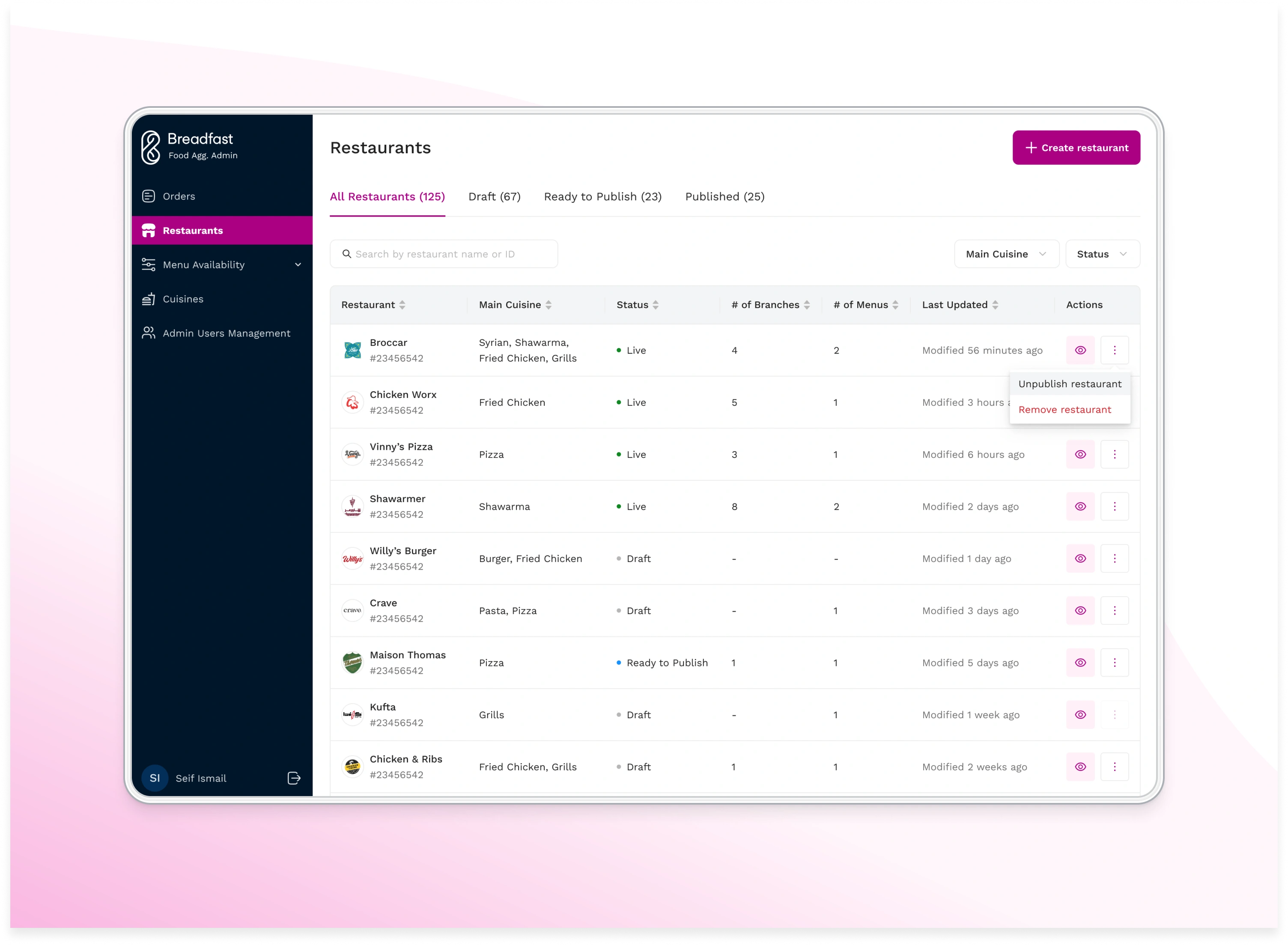
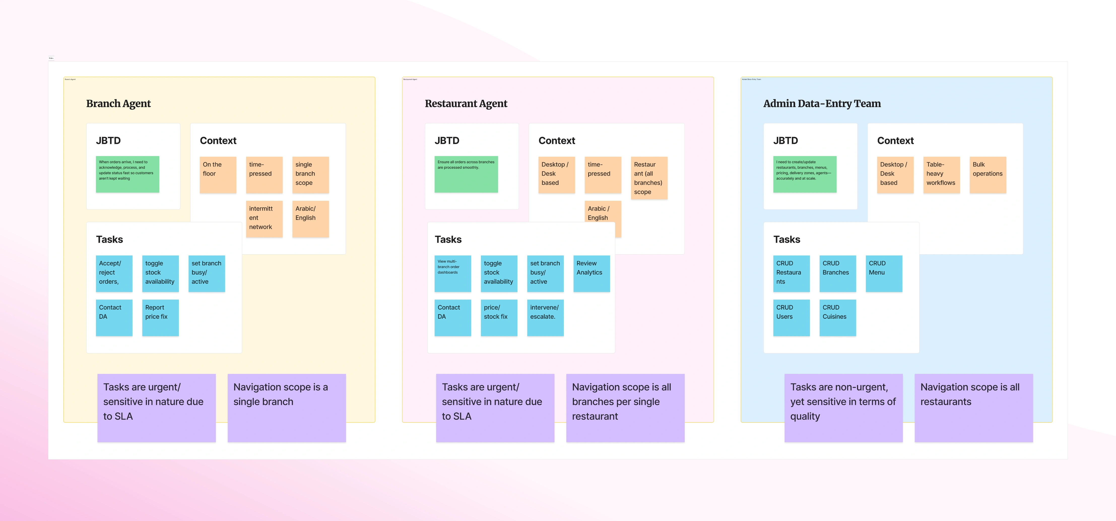
The PRD's split, internal dashboard vs. restaurant app, didn't survive first contact with the scope. The PM and I kept noticing the two "products" did the same things: same entities, same functionality, only the reach differed. The admin dashboard managed every restaurant; a restaurant managed itself; a branch managed only itself. That's not two products. That's one product at three levels of access.
So we argued for a single app on a single codebase, where access level renders a different UI for each role. The PM director pushed back, since two separate products is the safer-sounding story. What won it was that the alternative meant building and maintaining the same functionality twice, forever, to produce interfaces that were the same shape underneath. We were designing an enterprise system, which meant designing for roles, the actual jobs people do inside it, not invented personas.
To get the roles right rather than assume them, I ran short sessions with each internal department that would touch the system: operations, the content team uploading menus, customer support who needed live order access to help customers. That resolved into three core views. A Breadfast-employee admin view (I gave it a distinct nav color so internal users always knew they were in the internal tool), a restaurant view spanning all of a brand's branches, and a single-branch view. The restaurant/branch split wasn't cosmetic: some chains run a central team that accepts orders for every branch, others let each branch handle its own, and the white-label couldn't accommodate either cleanly. Underneath all of it I scoped a permissions layer, so creating a user means granting exactly what they should see and nothing more.
Mapping the system before drawing it
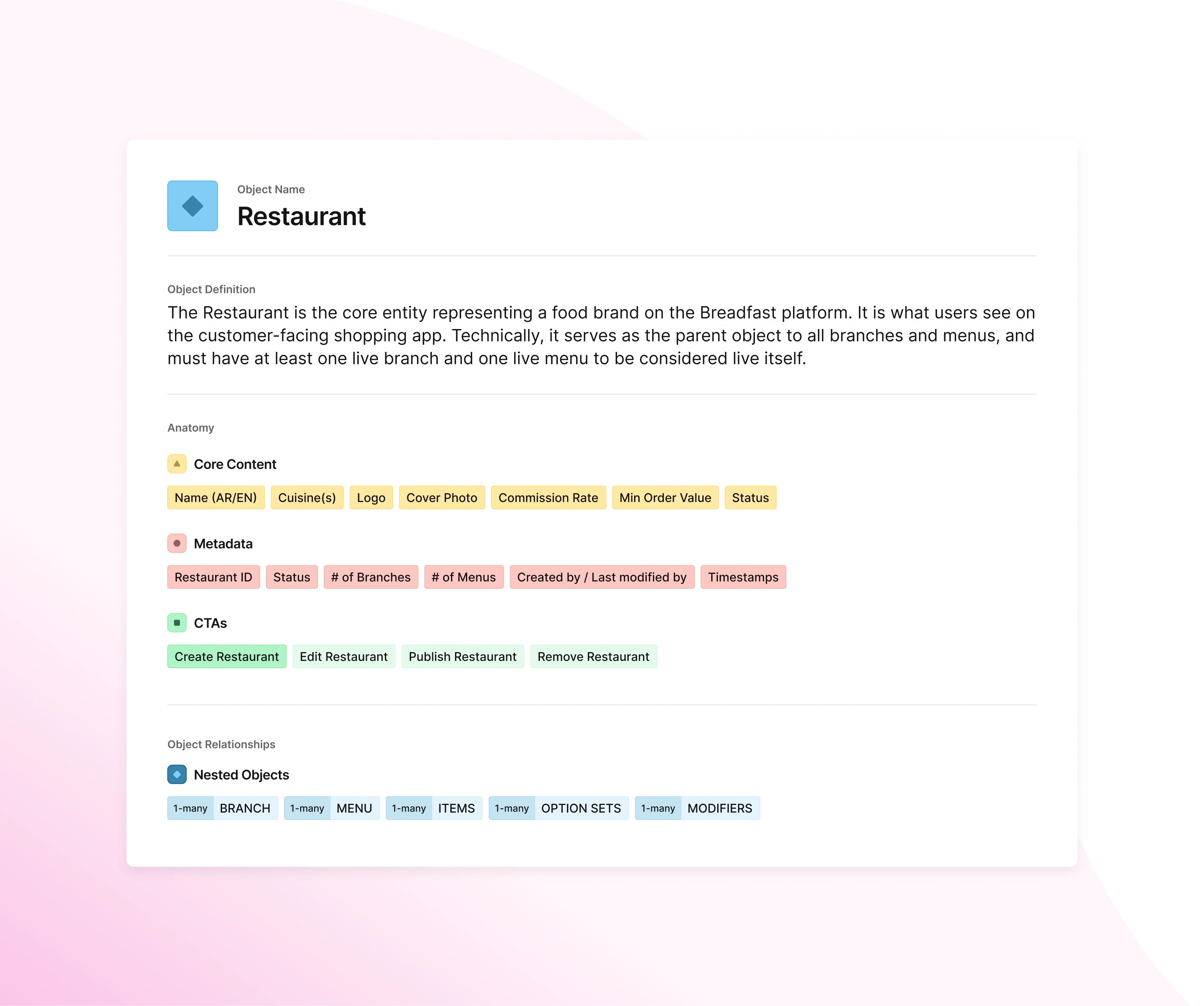
With the roles settled, the next risk was the information architecture, and it was genuinely complex. Many entities, many artifacts, dependencies running in every direction. I worked through it with Object-Oriented UX, because it let me model the entities and their relationships before committing to a single screen, and, just as important, it gave me a concrete thing to put in front of engineers early, before design decisions hardened into logic we couldn't afford to unwind.
That early modeling caught the kind of dependency that quietly breaks a system. A restaurant is only published on Breadfast if it has at least one active branch; a branch is only active once it has a delivery zone, a menu, assigned items, and so on. Which means deleting the menu or the zone of a restaurant's only active branch silently pulls the entire restaurant off the app. Modeling it as objects made that chain visible, so we could agree on the behavior up front: rather than block the action outright, I designed a deliberately heavy disclaimer for anything destructive enough to unpublish a restaurant, so the person clicking it feels the weight of what they're about to do.
The same modeling extended to integrations, because RMS didn't live alone. I mapped the full order journey with the engineers, from the moment a customer places an order to the moment it's delivered, to surface every hand-off to a separate system. The clearest case: marking an order ready for pickup triggers the fleet management system (FMS) to dispatch a driver. Delivery zones live in that relationship too, and the direction of authority mattered. A zone carries two statuses, one owned by FMS and one by RMS. If FMS marks a zone out of service, RMS has to honor it. But if food operations decide in RMS not to serve an area today, that's a local call, and it must not propagate back up into FMS. Designing that asymmetry deliberately, instead of discovering it in production, was the entire point of mapping it first.
Where the complexity becomes one card
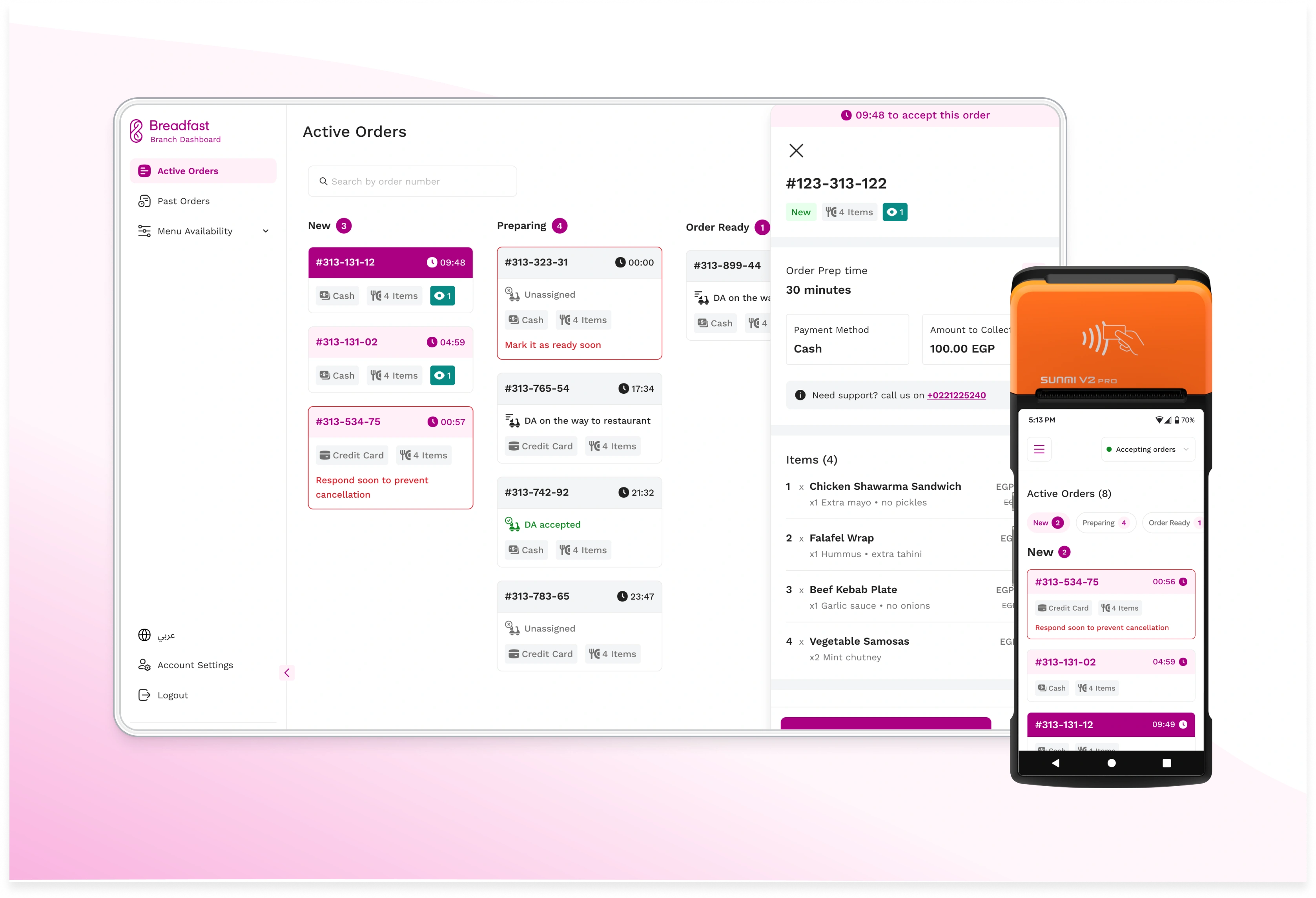
Everything above was in service of this: the place real people do real work, the restaurant view. And the discipline there was restraint. For all the system's depth, a branch team needs to do almost nothing. Accept and update orders, look back at past orders to reconcile finances, and toggle what's available. So the whole view is three nav items: active orders, past orders, menu availability. Nothing else earned a place.
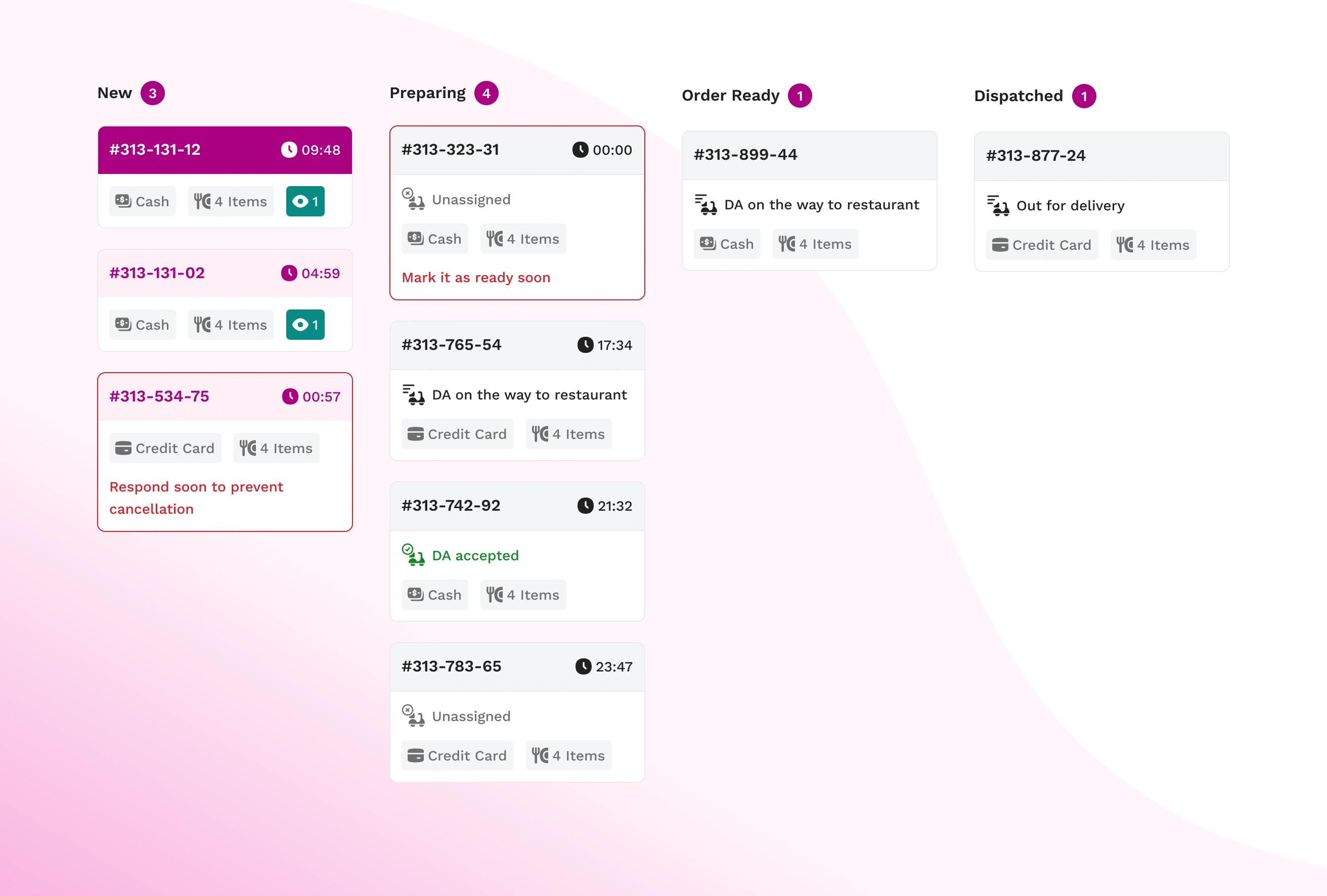
The order card carries more weight than any other surface in the product. It's what a branch worker reads, under time pressure, to decide whether to accept an order. I benchmarked the white-label and a range of other apps, but benchmarking only tells you what others chose, not what your users need, so I went to the source. With the PM, I interviewed branch and restaurant staff already using the existing app: what hurts, and what's the first thing you look for when an order lands? The answers were consistent. Order number, payment method, item count, first, every time. The items themselves matter for the accept-or-reject call, but there's no room to show them all on the card. So the hierarchy wrote itself: order number, payment method, item count, and the SLA countdown timer up front; everything else deeper.
Then I tested the thing that looks trivial and isn't: how to stack the cards on the active-orders wall. I'd planned a flat list with status badges. In usability testing, users pushed back toward grouping, and they were right. Grouping the cards by the four stages of an active order (new, preparing, ready, delivering) means an empty "new" group is itself information: one glance tells you there's nothing waiting. Within the queue, they didn't want most-recent first; they wanted most-late first, because the late order is the one demanding action. The grouping and the sort both came out of watching people work, not out of my first guess.
The receipt is the source of truth
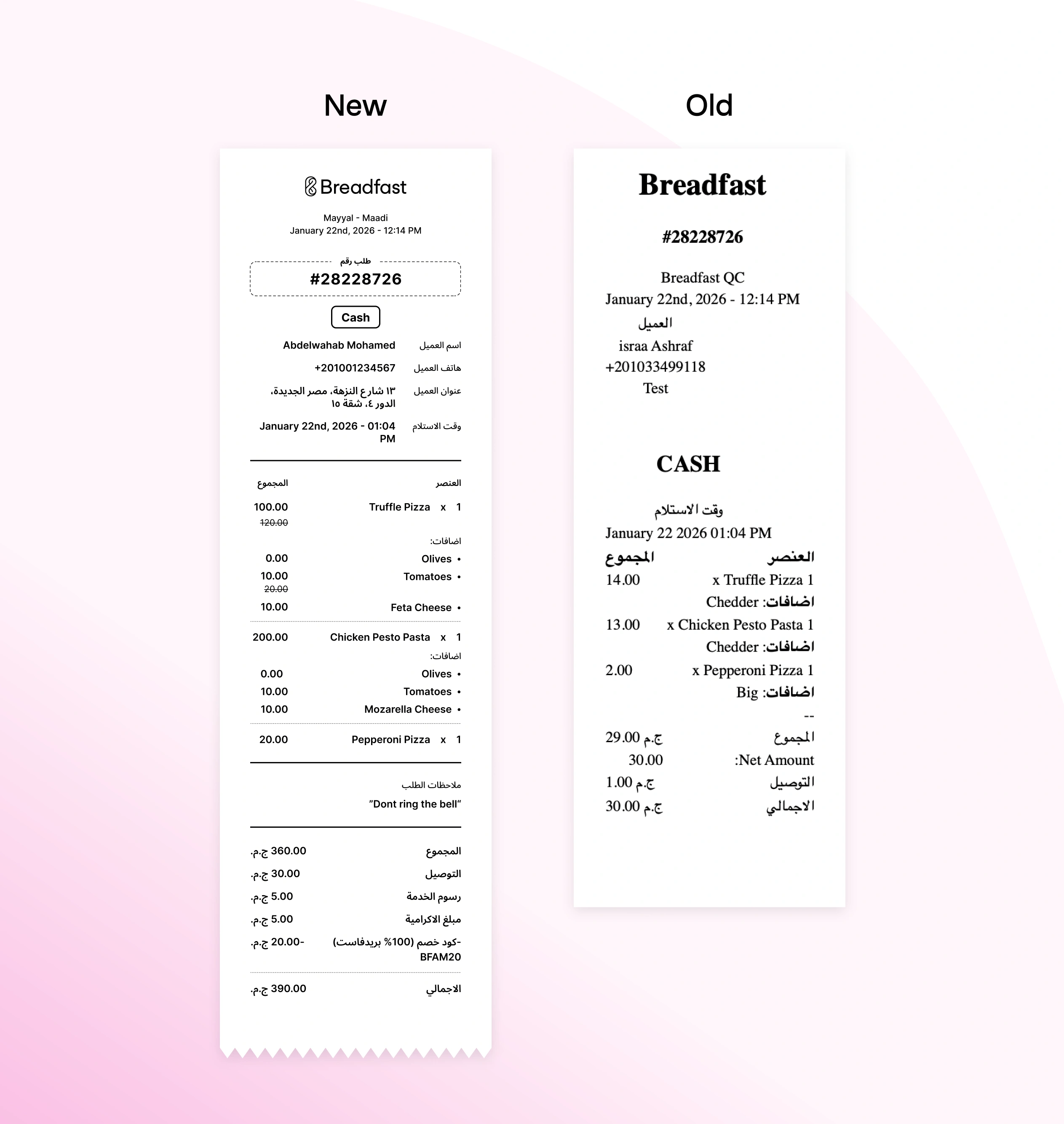
The branch device is effectively a POS, and accepting an order prints a receipt that, from then on, is what the branch actually works from. So I treated it as a real surface, not an afterthought. Two fixes: the old app would sometimes print nothing and say nothing, so I made print state explicit and unmissable in the app; and the receipt itself was a poorly organized data dump, so I redesigned its information architecture around how staff read it at the counter, based on their feedback.
Where it stands now
What I'd do differently
I'd fight the design system earlier. Everything internal at Breadfast runs on Ant Design, an off-the-shelf component library that some earlier project adopted and everyone quietly inherited as the default. It's great for standing a dashboard up quickly, but it's generic by design, and it never sat right against Breadfast's brand. By the time I was deep in RMS, working around its limits was cheaper than swapping it out mid-build, so I lived with it. But "it was already here" isn't a design decision, and it cost the product a more on-brand, less constrained interface. That's not a hypothetical regret: moving Breadfast's dashboards off it is something I'm actively working on now.